.png)

Product Detail Page Best Practices: How to Build a High-Converting PDP
What is a Product Detail Page (PDP)?
A Product Detail Page, or PDP, is the page where a potential customer decides whether to buy or bounce. It’s the digital equivalent of a salesperson walking you through a product in a store — showing you what it does, why it matters, and what makes it worth your money.
Every click that lands on a PDP means interest has already been earned. The visitor found your site, clicked your product, and now wants answers. The page’s job is to deliver all those answers fast and convincingly — what’s included, how it works, what others think, and what happens after they hit “Buy.”
Think of the PDP as both a pitch and a trust test. It needs to inform, persuade, and remove friction all at once.
The role of PDPs in the conversion funnel
The PDP sits at the sharpest point of the funnel — right between “I’m considering” and “I’m purchasing.” It’s where interest turns into intent.
A visitor might browse your homepage or product listing page (PLP) out of curiosity, but the PDP is where they pause and evaluate. Are the benefits clear? Do the photos help them imagine owning it? Is the price fair and transparent? If the page nails those questions, the cart gets filled. If it doesn’t, they click away.
This is why top ecommerce brands obsess over micro details here — button color, copy length, how the product looks on mobile. The PDP is where marketing, UX, and sales psychology collide.
Impacts on SEO, user experience, and trust
A great PDP doesn’t just sell. It drives traffic, builds trust, and fuels long-term brand credibility.
From an SEO standpoint, PDPs can rank for high-intent keywords — the ones that convert best. A well-optimized product page can bring in qualified buyers daily, not just browsers. Using structured data, clear titles, and keyword-rich descriptions helps Google understand what your product is and who should see it.
From a user experience angle, the PDP should feel effortless to navigate. Fast load times, responsive design, and scannable content all make the page feel polished and professional. A slow or cluttered PDP can ruin even the best product.
And from a trust perspective, everything counts — reviews, return policy, shipping clarity, even the way your images look. Shoppers are skeptical, especially with new or unknown brands. A PDP that feels honest, transparent, and visually consistent signals credibility before a single review is read.
When done right, the product detail page becomes more than just a page. It becomes a silent salesperson that works 24/7 — converting browsers into buyers while building trust in your brand’s story.
Core Elements of a High-Performing PDP
Product Title & Headline
Your product title is the anchor of the entire page. It’s what shoppers see first in search results, ad previews, and when they land on your site. A good title balances clarity and keyword relevance. It tells both people and search engines exactly what’s being sold.
Here’s the trick. Start with the product name, then layer in the key attributes people actually search for. Model, color, size, or version if it applies. “Nike Air Zoom Pegasus 40 Running Shoes – Men’s, Blue, Size 10” is long, but it answers every buying question in one glance.
Avoid cute or vague names. They might look clever in a campaign, but they don’t convert. The goal is clarity first, creativity second.
Visual Media (Images, Videos, 360° Views)
People don’t read product pages. They scan and look. That’s why visuals carry most of the conversion weight. Multiple high-resolution images from different angles build confidence. Shoppers want to zoom in, see textures, and imagine how the product fits into their world.
If possible, include lifestyle photos that show the product in use. A kitchen gadget on a counter, a jacket on a real person, or a sofa in a styled room. These context shots help the brain process value faster than any line of text.
Video takes it even further. A 15-second clip showing how a feature works can replace paragraphs of description. For high-consideration items, 360-degree views are gold. They recreate that “in-store” feel where buyers can inspect every detail before deciding.
Pricing, Discounts & Variants
Your pricing section needs to be crystal clear. No one should have to guess what they’re paying or why. Display the current price in a larger, bolder font. If you’re offering a discount, show the old price with a clear “was / now” comparison. Transparency matters more than hype.
If your product has multiple variants, make sure price changes automatically when a shopper selects a new color or size. That instant feedback keeps trust intact.
For multi-pack or bulk products, add the unit price. It helps people justify the cost and makes you look fair. Hidden fees or unclear totals are conversion killers.
Product Description & Key Features / Bullets
The perfect description blends facts with storytelling. Use short, scannable bullet points to highlight the top five features or benefits. Keep it human. Instead of “Made from durable stainless steel,” try “Built from stainless steel that doesn’t bend or rust even after years of use.”
Under the bullets, add a more detailed section that explains how the product works, who it’s for, and why it’s different. Avoid the common mistake of listing specs without context. Features are what it is, benefits are what it does.
Keep the tone honest. Shoppers can smell exaggeration. The goal isn’t to oversell, it’s to make buyers nod along thinking, “Yep, that’s exactly what I need.”
Call to Action (CTA) & Purchase Mechanism
The “Add to Cart” or “Buy Now” button is your conversion trigger. Make it impossible to miss. Use contrasting colors that fit your brand, and give it space to breathe. It should be the most visually dominant element on the page.
Add secondary CTAs like “Add to Wishlist,” “Compare,” or “Notify Me” when a product is out of stock. They keep engagement alive even if the customer isn’t ready to buy right now.
If your PDP is long, use a sticky CTA that follows the user as they scroll. That small tweak alone can boost conversions significantly, especially on mobile.
Availability, Shipping & Returns Info
Uncertainty kills conversion faster than price. Always display availability clearly. “In stock,” “Only 3 left,” or “Ships in 2–3 days” sets expectations and triggers urgency.
Next to your CTA, include estimated shipping cost and delivery time. Shoppers shouldn’t need to reach checkout just to find out if it’s free shipping or five-day delivery.
Also, highlight return policies and warranties near the purchase section. Simple phrases like “30-day returns, no questions asked” reduce anxiety and boost trust. Transparency wins here every time.
Social Proof: Reviews, Ratings, Q&A
Nothing builds trust faster than seeing real people talk about a product. Display the average rating and total number of reviews at the top of the section. Then, show a few sample reviews that feel authentic — ideally with customer photos.
Encourage user questions and answers. A simple Q&A section reduces uncertainty and often answers objections before they become deal-breakers.
When negative reviews appear, don’t hide them. Respond with clarity and empathy. It shows you stand behind the product and care about customer experience. Ironically, a mix of good and bad reviews often converts better than a perfect five-star page.
Cross-Selling / Related Products / Upsells
A well-placed “You may also like” section can increase order value without feeling pushy. Use it to suggest complementary items or upgraded versions. For example, if you sell a camera, show compatible lenses or accessories.
Keep it visually distinct but not distracting. The main product should always stay in focus. These sections are there to inspire, not to steal attention from the add-to-cart moment.
UX & Layout Best Practices
Layout & Navigation
A great PDP layout feels invisible. It just works. Visitors shouldn’t have to think about where to find specs, reviews, or the add-to-cart button. The content should flow naturally from top to bottom, guiding the shopper step by step through curiosity, consideration, and action.
Avoid hiding important information inside horizontal tabs. Most users skip them entirely. Instead, use clear vertical sections that unfold as you scroll. Each part of the page should have its own visual rhythm. Title, visuals, price, features, reviews. Clean spacing and consistent typography help users feel confident that they’re on a trustworthy site.
Navigation also matters. Keep the header and breadcrumb trail visible so users can go back to a category or previous product without losing their place. Consistency across every PDP makes your site feel cohesive and reliable.
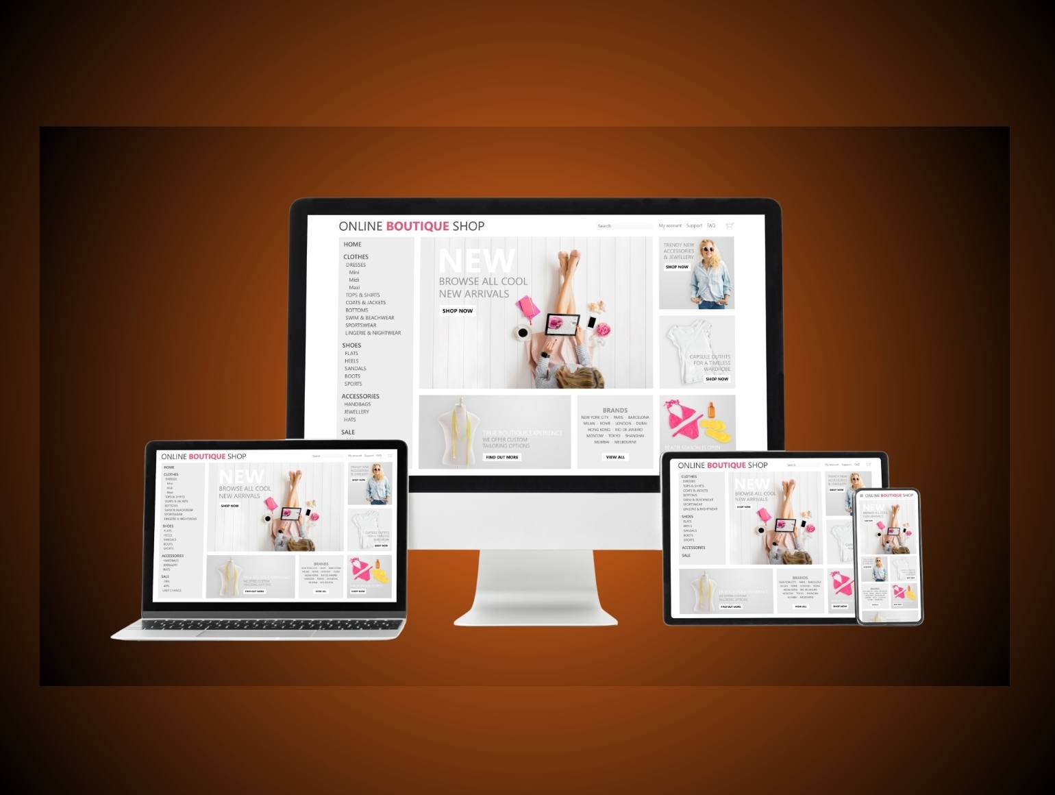
Mobile / Responsive Optimization
More than half of PDP visits now happen on mobile, so mobile-first design is no longer optional. Every element should resize, reflow, and reorder naturally on smaller screens. Images must remain sharp, buttons easy to tap, and load times fast.
Sticky CTAs are essential here. If someone scrolls through reviews or details, the purchase button should always stay visible. A single second of hesitation on mobile can cost a conversion.
Prioritize what matters most above the fold. Product title, main image, price, rating, and CTA should all appear before the first scroll. Keep extra info like specs or policies below. That way, users get the essentials right away and decide if they want to explore further.
Minimize Distractions
Every pixel on a PDP should serve a purpose. Popups, flashing banners, or irrelevant recommendations only pull attention away from the product. Clean layouts make people feel safe to buy.
If you use popups for discounts or email captures, trigger them after engagement, not immediately. Let the shopper experience the product first. The goal is to guide, not interrupt.
Use white space strategically. It helps the eye rest and gives important elements more focus. The simpler the page feels, the easier it is for a buyer to move from curiosity to checkout.
Scannability & Readability
People don’t read walls of text, they skim. That’s why scannability can make or break a PDP. Break long paragraphs into short, readable chunks. Use bold text to emphasize benefits or key features.
Headings and subheadings should tell a mini story on their own. A shopper should understand what the product does just by glancing down the page.
Technical products often need tables or “spec sheets” for quick comparison. Present these cleanly, using rows and columns instead of cluttered paragraphs. A readable PDP builds trust because it respects the buyer’s time.
The best PDPs combine clarity with a touch of rhythm. They move the reader forward naturally, like a good conversation between a helpful salesperson and a curious shopper.
SEO & Technical Optimization for PDPs
URL, Meta Title & Description
SEO begins with structure. Your URL should be short, descriptive, and keyword rich. Avoid random numbers or strings. A clean example would be yourstore.com/products/wireless-bluetooth-headphones. It tells both users and search engines what the page is about.
Meta titles and descriptions work like mini ads in search results. Keep the title under 60 characters and make it specific. “Wireless Bluetooth Headphones with Noise Canceling | Brand Name” is clear and searchable. The meta description should summarize the core benefit in one or two short sentences. Mention the main feature, price range, or unique value.
These small optimizations might seem technical, but they drive clicks before anyone even lands on your PDP.
Structured Data (Schema Markup)
Structured data helps search engines understand what your page contains. Product schema tells Google your item’s name, SKU, price, availability, and rating. Review and offer schema can add stars and pricing directly in search results, which attracts more clicks.
You can also include breadcrumb schema to clarify your site hierarchy. It shows where the PDP sits within your category tree. When all of these elements are in place, Google can index and display your PDP more accurately.
Schema is invisible to users but essential for visibility. Think of it as translating your product details into a language search engines speak fluently.
Internal & External Linking Strategy
Links help both users and search engines navigate your store. Use internal links to connect each PDP to related products, accessories, and parent categories. Breadcrumb navigation should always be visible so visitors can jump back without confusion.
Externally, encourage backlinks from blogs, review sites, or affiliates who mention your products. These links increase authority and signal that your PDP is credible.
Avoid overlinking inside descriptions. Keep the focus on the main product while still giving users ways to explore deeper if they choose.
Page Speed & Performance
Speed is conversion fuel. If your PDP takes more than three seconds to load, most visitors will leave. Optimize every image before upload. Compress files without losing clarity and enable lazy loading so images appear as users scroll.
Minimize heavy JavaScript and unused CSS. Choose a fast, reliable hosting setup and use caching to serve repeat visitors faster. Performance directly affects both SEO and sales. A fast PDP feels professional and builds confidence subconsciously.
Canonicalization & Duplicate Content
Ecommerce stores often generate multiple URLs for the same item, especially when variants like color or size exist. Without canonical tags, search engines may view these as duplicate pages. That splits ranking power and lowers visibility.
Set a canonical tag on each PDP that points to the main version of the product. This tells Google which page to prioritize.
Handle faceted navigation carefully. Filtered URLs for sorting or variants should not all be indexed. Keep your index clean so only valuable PDPs show up in search.
A strong technical foundation gives your content and design a real chance to shine. When SEO, performance, and clarity align, your PDP becomes more discoverable, trustworthy, and profitable.
Conversion Optimization Techniques
Scarcity & Urgency Cues
Shoppers make faster decisions when they feel a sense of urgency. Subtle cues like “Only 3 left in stock” or “Sale ends in 4 hours” can increase conversions without feeling manipulative. The key is authenticity. Never fake scarcity, people can tell, and it damages trust.
Countdown timers for limited-time offers or seasonal sales work well when used sparingly. Position them close to the price or call-to-action button where users are already in decision mode. These small emotional triggers create momentum and prevent hesitation.
Trust Signals & Guarantees
Before anyone clicks “Buy Now,” they want to know the transaction is safe. Trust signals like SSL badges, verified payment icons, or money-back guarantees reassure customers at the point of purchase. They reduce anxiety and build confidence.
Include brand information, warranty details, and simple refund terms near the purchase section. A short line like “30-day money-back guarantee” does more to convert than long paragraphs of policy text.
Tell your brand story briefly. When shoppers see that a real team stands behind the product, they are more likely to complete the checkout. Authenticity beats corporate polish every time.
Personalization / Dynamic Content
Modern PDPs adjust based on who is visiting. Use browsing history, location, or purchase behavior to customize what shoppers see. If someone viewed a similar product earlier, show a message like “Pairs perfectly with the jacket you liked.”
Geolocation can help display accurate shipping times or currency. Personalized experiences reduce friction and make the shopper feel understood.
Even small touches matter, such as showing recently viewed products or recommending items that align with a user’s search behavior. The goal is relevance without intrusion.
A/B Testing & Analytics
Guessing rarely leads to growth. Testing does. A/B testing helps you compare two versions of a PDP to see which performs better. Try changing one element at a time, such as the button color, headline wording, or image placement. Measure the difference in conversion rate before deciding what to keep.
Use heatmaps and click tracking to understand how visitors interact with the page. You might find that users ignore a key section or scroll past the main benefit. Adjust and test again.
Monitor bounce rate, add-to-cart rate, and checkout abandonment. These metrics reveal what’s blocking conversions. The goal is not perfection but continuous improvement. Small, data-driven tweaks compound into major revenue gains over time.
A high-performing PDP isn’t built once, it’s refined constantly. Conversion optimization turns a good product page into a silent salesperson that learns and adapts with every visitor.
Implement AI-Powered Features
One way to future-proof your PDP is by layering in AI features that make the page smarter and more responsive. Shopify even lists “Implement AI-powered features” as a top best practice for PDPs. Shopify
Here are some AI enhancements you can bring into your PDP:
- Automated Descriptions & Alt Text
Use AI (like Shopify Magic or other generative tools) to draft product descriptions or alt text for images. The key is to let AI do the heavy lifting, then review and refine for brand voice and accuracy. This speeds up your content creation while keeping consistency. Shopify+1 - Personalized Recommendations
AI can dynamically surface related or complementary products based on a user’s browsing history, purchase patterns, or behavior in real time. This makes cross-selling and upselling feel organic, not pushy. Shopify+2Shopify+2 - Predictive Variant Suggestions
Based on user data, AI can suggest the most likely variant (size, color, model) that might interest the shopper and auto-select it, reducing decision friction. - Smart Chat & Assistant Support
Embed AI chatbots that answer questions in context, suggest alternatives, and help with objections (e.g., “Does this fit true to size?”). These assistive agents can engage without human intervention around the clock. - Dynamic Pricing & Urgency
AI can help manage surge pricing or limited-time offers by analyzing inventory levels, demand, or competitor prices. It can also trigger urgency cues when stock is low. - Enhanced Search & Discovery
Use AI to power visual or semantic search (e.g. shoppers upload a photo, find similar products) or auto-complete suggestions when someone types in the PDP’s search field.
When implementing AI, keep two principles in mind: transparency and oversight. Let users know when something is AI-driven (e.g. “Suggested for you”) and always monitor for errors or odd suggestions. AI should amplify your PDP, not become a blind autopilot.
Examples / Case Studies
Apple – Precision and Minimalism in Action
Apple’s product detail pages are a masterclass in clarity. Every section feels intentional. The product name is clean, the headline focuses on experience, not specs. The visuals do most of the talking. Each image is crisp, well-lit, and paired with short, emotionally driven copy that highlights real benefits rather than technical jargon.
The page flows like a story. Visitors start with the hero shot, then scroll through design details, feature explanations, and user benefits. The “Buy” button stays visible without distracting from the exploration. There’s no clutter, no popups, just confidence and calm. Apple proves that less can convert better when every pixel supports trust and usability.
Nike – Energy, Movement, and Personalization
Nike’s PDPs are built to move. They combine bold visuals with interactive features that keep shoppers engaged. Zoom effects, 360-degree views, and videos that show products in motion make you feel like you’re already using the item.
Personalization plays a key role too. Nike highlights color and size variants dynamically, updating pricing and stock information instantly. The reviews and star ratings appear near the call-to-action, offering social proof at the exact moment of purchase consideration.
What makes Nike’s approach powerful is the emotion it carries. Every PDP feels alive, reinforcing the brand’s active, energetic identity. It shows how design and storytelling can coexist with performance-driven conversion tactics.
Amazon – Function and Trust at Scale
Amazon’s pages might not be pretty, but they convert better than almost anyone’s. The layout focuses entirely on usability. Product title, price, delivery options, and reviews appear above the fold. Nothing hides behind a click.
The review system drives confidence. Seeing thousands of ratings and verified purchase tags creates instant credibility. The “Frequently bought together” and “Customers also viewed” sections generate consistent cross-sells while still feeling helpful.
Even though the design feels busy, every piece of information has a purpose. Amazon’s success proves that trust, clarity, and accessibility can outperform aesthetics when executed consistently.
Lessons from the Best
- Clarity wins. Each brand avoids confusion and presents core information up front.
- Visuals sell emotion. Whether minimalist or energetic, the images connect with how the buyer wants to feel.
- Trust drives conversions. Reviews, guarantees, and transparent pricing lower hesitation.
- PDPs tell stories. The best pages guide users through discovery, validation, and decision without breaking flow.
Great PDPs aren’t copied, they’re engineered. Every design choice, sentence, and interaction aims at one outcome: helping someone feel certain enough to buy.
Common Mistakes & How to Avoid Them
Relying Too Much on Tabs
Tabs might look neat, but they often hide key information. Many users never click them, especially on mobile. When product descriptions, specs, or reviews sit behind tabs, engagement drops sharply. It feels like work to explore.
Instead of splitting details into hidden panels, stack them vertically. Use collapsible sections or anchors so the page feels organized but still visible at a glance. Every extra click is a risk that someone will leave. Keep the experience effortless.
Using Poor or Only One Image
One flat product photo is never enough. It forces buyers to imagine what they cannot see. That uncertainty kills confidence. Even small brands can compete visually with multiple clean shots.
Include angles, lifestyle context, and close-ups that show texture or materials. High-quality images sell trust as much as they sell the product itself. A shopper should feel like they could reach out and touch what they see on screen.
Over-Cluttered Design or Too Many Distractions
Popups, banners, and animated ads might seem like clever engagement tactics, but they often overwhelm visitors. A cluttered PDP looks unprofessional and confusing.
Simplify the layout. Let breathing room guide the eye toward the key action, which is adding to cart. Every design choice should serve that one goal. White space, clear hierarchy, and predictable flow make people feel safe enough to buy.
Lack of a Clear CTA
It’s shocking how many PDPs bury the purchase button or use vague labels. If the CTA blends into the background or competes with other elements, conversions drop instantly.
Use a bold color that contrasts with the rest of the design. Keep the text simple and direct, like “Add to Cart” or “Buy Now.” Avoid tiny buttons or complicated checkout journeys. Make it obvious what comes next.
Not Disclosing Shipping or Return Policy Early
Hidden costs are one of the biggest causes of cart abandonment. Shoppers want transparency. If they can’t find shipping fees, delivery timelines, or return terms before checkout, they lose trust.
Include this information near the price or CTA. Even a short line like “Free shipping on orders over $50” or “30-day returns” keeps people confident. The earlier you set expectations, the smoother the conversion path becomes.
Duplicate Content and Weak SEO
Copying manufacturer descriptions might seem like a shortcut, but it hurts both rankings and credibility. Search engines view duplicate text as redundant, and users find it generic.
Rewrite every description in your brand voice. Add context about use cases, benefits, or comparisons. Even a few original sentences can separate your PDP from dozens of competitors selling the same product.
Strong SEO begins with originality and structure. Weak content might fill space, but it never builds authority.
Main Takeaway
Most PDP mistakes come from trying to do too much or too little. Either the page overwhelms visitors with noise or offers too little information to make them feel confident. The sweet spot is clarity mixed with credibility. Every pixel, line, and image should serve the shopper’s decision to buy.
Checklist / Summary – PDP Optimization
A strong Product Detail Page is built from hundreds of small choices that quietly work together. Here’s a quick checklist to help you evaluate if yours is ready to convert.
Product Fundamentals
- Title includes brand, model, and main attributes like color or size.
- Meta title and URL contain target keywords.
- High-resolution images show the product from multiple angles.
- Lifestyle photos or short videos add real-world context.
- Price and discounts are visible without scrolling.
- Variants update price and availability instantly.
- Short bullet points highlight top features and benefits.
- Detailed description explains use cases clearly and honestly.
Conversion & Trust
- Call-to-action buttons are large, visible, and consistent.
- Secondary CTAs such as Wishlist or Compare appear near the main one.
- Stock level and delivery time are displayed near the price.
- Clear return, warranty, and refund details build confidence.
- Reviews, ratings, and Q&A are active and visible.
- Security and guarantee badges are placed near checkout sections.
User Experience
- Page layout flows vertically with clear sections.
- Design is mobile responsive and touch friendly.
- Sticky CTA follows the shopper as they scroll.
- Text is easy to scan using headings, bullets, and short paragraphs.
- No intrusive popups or banners block core content.
- Breadcrumb navigation and internal links support easy browsing.
Technical & SEO Health
- Images are compressed for fast loading.
- Schema markup includes product, rating, and offer data.
- Canonical tags handle duplicate variant URLs correctly.
- Meta descriptions summarize the value proposition naturally.
- Page speed is under three seconds on mobile.
Conversion Optimization
- Scarcity and urgency cues are honest and clear.
- Personalized content shows relevant products or recommendations.
- A/B testing is used to refine CTA placement, color, and copy.
- Analytics track scroll depth, bounce rate, and cart abandonment.
A well-optimized PDP doesn’t just inform, it persuades. It removes uncertainty and leads buyers toward a confident “yes.” When every element supports clarity, trust, and speed, the product page becomes a living asset that sells around the clock.


.png)
.png)