.png)

The Complete Guide to eCommerce Website Design That Converts
Importance of Ecommerce Website Design
Impact on User Experience
Good design isn't decoration. It's navigation, clarity, and rhythm. When a customer clicks through your ecommerce site, every visual cue either guides or distracts. Clean layouts, razor-sharp imagery, and intuitive flow make people feel like they're in control. That sense of ease keeps them exploring, adding to cart, and coming back.
When product images load fast, suggestions feel tailored, and the experience feels coherent, your site earns trust on instinct. It’s not just colors and typography — it’s how everything moves together. A properly designed ecommerce site feels like it finishes your sentence.
Influence on Conversion Rates
Design touches conversion at every turn. Slow-loading hero images, cluttered navigation, and jarring product photos are silent killers. If customers can’t find what they’re after or second-guess the quality of what they see, they abandon.
The brands that win invest in fast, consistent product imagery, smooth cart experiences, and mobile-first layouts. That’s where design and strategy overlap. Conversion isn’t magic — it’s alignment between what your customer expects and what your design delivers.
Building Brand Credibility
Shoppers size up your brand in milliseconds. A beautiful design tells a story before anyone reads a word. When visuals feel thoughtful, when every image fits your vibe, that’s credibility in motion.
It’s not just about being “pretty.” It’s trust. Evangelist-level loyalty begins when the site signals professionalism in every pixel. Product photos? They need to look real, aspirational, and on-brand. That’s where partners like Pixofix come in — not just brushing up photos, but keeping the storytelling sharp, consistent, and fast. Because brand credibility has a visual language. And it speaks faster than copy ever could.
Key Principles of Effective Ecommerce Design
Clear Navigation and Layout
If your customer has to think twice about where to click, you’ve already lost them. Great navigation isn’t flashy — it’s invisible. Every link, tab, and dropdown should feel like instinct. Structure your menus with clarity, not cleverness. Keep it shallow. Three clicks or fewer to checkout, product discovery, or customer service.
Layouts should follow the natural eye path. Lead with impact visuals, then guide toward product benefits and calls to action. And keep the distractions out. No popups until they’re welcome.
Mobile-Responsive Design
More than half of ecommerce traffic happens on mobile. Design that ignores that isn’t just outdated — it’s losing sales. But mobile-responsive doesn't only mean shrinking things. It means rethinking them.
Thumb-friendly navigation, lightweight images, smart cropping, and checkout pages that work while your customer’s on the go — that’s what responsive design really looks like. Test it. Then test it again. What works on a desktop often dies on a 6-inch screen. Design mobile-first, then build up.
Visual Hierarchy and Aesthetics
The right visual hierarchy makes your customer feel like they’re always looking in the right place. Headlines should pop, product titles should lead, and ‘Add to Cart’ should never fight for attention. Guide them, don’t overwhelm.
Aesthetics go beyond polish. They carry the tone of your brand. Whether it’s minimal luxury or maximalist streetwear, the color, typography, and negative space should all reinforce one vibe. Combine that with high-quality, on-brand product photos, and everything clicks. It's not about having more visuals. It’s about being intentional with what you show and where you show it.

Essential Features for Ecommerce Websites
User-Friendly Shopping Cart
The cart isn’t just a bucket. It’s your final pitch. It should be persistent, easy to access, and friction-free. Let customers adjust quantities, save favorites for later, and understand costs upfront. Show visuals in the cart — it reconnects them emotionally with the product.
Too many brands lose buyers here because of bad UX. Confusing totals, hidden fees, disappearing items — it all breeds doubt. The cart should reinforce confidence. Not undo it.
Secure Payment Options
Trust breaks at checkout. One sign of insecurity, and users bounce. Offer diverse, well-known payment methods — think PayPal, Apple Pay, Stripe — and highlight your security certifications clearly but non-intrusively.
Checkout should never feel like a call center form. Keep it streamlined. Give users the option to check out as a guest. And keep everything visual — formatting errors, card type symbols, in-cart validation. All of it builds that final layer of assurance customers need to click “Place Order.”
Efficient Search Functionality
Shoppers land on your site knowing what they want. Or at least, thinking they do. Search should help them refine, discover, and decide — fast. Fast-loading, auto-suggesting, typo-tolerant search bars turn casual browsers into confident buyers.
Use intelligent filters: by color, price, fit, style. And pair them with product imagery that instantly reflects those changes. The faster the feedback loop between decision and visual confirmation, the smoother the conversion. That’s search working like a showroom.
Creating a Seamless Customer Journey
Optimizing Product Pages
Product pages aren’t just about details. They’re about transferring desire into action. Lead with hero imagery that’s clean, consistent, and emotionally engaging. The photo should answer, “Does this fit my style?” before specs even come into play.
Descriptions should inform without overloading. Highlight key features above the fold and keep technical data clean and scannable. Include contextual photography, zoom functionality, and curated visuals that match the brand vibe — that’s where polished, on-brand imagery from studios like Pixofix turns browsers into believers.
Need help optimizing your product pages? Read our full guide: Product Detail Page Best Practices: How to Build a High-Converting PDP
Streamlined Checkout Process
Every second added to checkout is a sale waiting to vanish. Remove excess steps, avoid redundant fields, and lean into smart autofill or address validation tools.
Progress indicators, clean design, and error-proof inputs reduce anxiety. And once they’ve committed to checking out, never redirect or distract. Keep them in the conversion zone until the thank-you page. Then, and only then, let upsells and brand loyalty kicks in.
Personalized User Experience
Relevance trumps volume. When users are shown products and content aligned with their style, history, and behavior, engagement naturally rises. Personalization doesn’t have to be creepy — it just has to be intelligent.
Use browsing behavior to tailor homepage modules, product bundles, and content blocks. Even product photography can be dynamically served to highlight seasonal visuals or region-specific preferences. Pair that with AI-assisted editing that keeps pace with personalized campaigns — and you get visuals that stay both fast and fresh.
Tools and Frameworks for Ecommerce Design
Popular Design Platforms
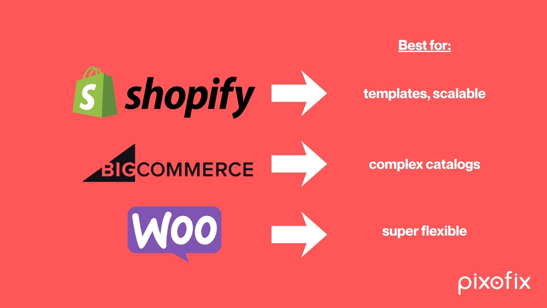
Platforms like Shopify, BigCommerce, and WooCommerce make launching fast. But it’s not about plug-and-play. It’s about tailoring the framework to your brand’s visual DNA.
Each platform has different strengths. Shopify is ideal for template speed and scalability. BigCommerce for complex catalogs. WooCommerce for ultimate flexibility. But no matter your stack, your design decisions live or die on how well visuals and UX integrate with your product core.
Utilizing Design Templates
Templates can accelerate design — if used intelligently. Choose one that matches your navigation needs and content structure, not just your aesthetic. Strip away what doesn’t serve your brand. Add what reflects your customer journey.
Then customize it visually. Replace generic theme imagery with branded content. That’s where teams like Pixofix slot in — smoothing production workflows, syncing photo retouching with your launch pace, and making sure your visual story stays intact through every layout shift.
A/B Testing Tools
Design never ends. Every color, copy tweak, and layout change should be validated in real-world conditions. That’s where A/B testing tools like Google Optimize or Convert come in.
Test headline placements. Image combinations. CTA styles. Even different product page layouts. And don’t just chase statistics — look at behavior. When paired with visual performance data, it becomes obvious which images convert and which just look nice. That’s the edge. The combination of craft, speed, and signal.## Workflow Example: Photo Integration Strategy
Selecting the Right Images
Not every photo deserves space on your product page. Choose visuals that do more than just show — they should evoke. Hero images need to instantly communicate fit, function, and feeling. Lifestyle shots should transport the shopper. Detail shots must answer questions before they’re asked.
Visual inconsistency is a silent killer. Build a style guide that dictates lighting, crop ratios, negative space, and retouching boundaries. Then follow it religiously. Don’t leave your brand’s visual identity up to chance. Use the same lens, angles, and color grading to keep your story intact from one thumbnail to the next.
Image Optimization Techniques
Large, uncompressed images grind performance to a halt. But compression without care? That makes product fabrics look cheap and kills realism. Set a balance. Save in modern formats like WebP for quicker load speeds without munching quality.
Use CDNs to serve images globally, lazy load below-the-fold visuals, and serve different resolutions based on screen size. Zoom functionality needs high-res assets — make sure they load only when they’re needed. AI-enhanced tools can now batch-optimize with brand-level control, but human-eyed QA (or a partner like Pixofix) keeps quality from slipping through the cracks.
Example Before and After Images
Drag a slider over a side-by-side and the lesson is instant. On the left: dull lighting, wrinkled fabrics, off-tone skin. On the right: clean highlights, straight silhouettes, skin tones adjusted to pop without looking plastic.
A badly-lit flatlay can become a high-converting detail shot. A cluttered lifestyle photo, once cropped tight and re-graded, brings focus to the product’s design. Pixofix often works with studios to build these transformation pipelines — before-and-afters that don’t just “correct” but elevate. The end goal? Realism that feels editorial, not artificial.
Common Mistakes in Ecommerce Design
Ignoring Mobile Users
If your product page looks incredible on a monitor but breaks on a phone, you’ve already lost half your audience. Font sizes shouldn’t require pinching. CTAs shouldn’t compete with your thumbs. And images must feel crisp even on lower bandwidth.
Too many brands design for desktop then shrink everything down. The result? Disconnected layouts, cropped visuals, and abandoned carts. Mobile-first isn’t an option. It’s survival.
Overcomplicating Navigation
Filtering shouldn’t feel like filing taxes. Mega-menus packed with unnecessary categories slow everyone down. Divide your catalog by how users actually think — not how your back end is structured.
Make sure breadcrumbs stay visible. Search bars should be persistent. And under no condition should your menu hide the cart. If users feel lost, they leave.
Failing to Showcase Products Effectively
You can have a great product and still blow the sale if your imagery is off. Blurry, inconsistent, or off-brand photos create friction. So do missing angles, lazy cropping, or irrelevant context.
Your images are your sales team. Zoom-worthy detail. Styled lifestyle. Realistic colors. Every product should feel alive. When studios treat photography as an afterthought, conversion tanks. Brands that win use teams like Pixofix to build repeatable, tailored photo workflows — fast, consistent, on-brand, every time.
Optimization Tips for Better Performance
Implementing SEO Best Practices
Design without SEO is lipstick on a ghost. Every image needs alt text that reads like a caption, not code. Each URL should describe the product in human language. Schema markup boosts how your listings appear in search and gives context Google loves.
Header tags should follow hierarchy, not style. And product page descriptions? Build them for buyers first, algorithms second. Keyword stuffing kills conversion.
Enhancing Page Load Speed
Heavy pages hurt both ranking and experience. Audit your code — trim what you’re not using. Strip third-party scripts unless they earn their keep. Image compression, asynchronous JavaScript, and content delivery networks can shave seconds without breaking style.
Don’t guess. Use real performance tools like Lighthouse or WebPageTest to see where things lag. If it feels slow on your phone, it’s twice as bad on a customer’s.
Monitoring User Feedback
What you see in your analytics is only half the story. Heatmaps and scroll tracking show you behavior, but open-text feedback uncovers why users struggle or bounce.
Build in frictionless requests for feedback post-purchase or post-abandonment. Ask about photo clarity, page load, mobile flow. If a pattern emerges — users constantly frustrated by unclear product visuals — it’s time to recalibrate your content pipeline. Brands using Pixofix often adjust photo strategy based on this loop, tuning for clarity, emotional pitch, or lifestyle depth based directly on annotated user insights.
Key Metrics to Measure Ecommerce Success
Analyzing Conversion Rates
This is the moment of truth. It tells you if your site turns browsers into buyers. Track it not only site-wide but by product category, mobile vs. desktop, ad source, and time of day.
If certain categories underperform, dig into the presentation. Is the imagery telling the right story? Are CTAs blocked or obscured? Sometimes all it takes is reordering product shots or tightening the copy around a feature to swing the numbers upward.
Tracking Bounce Rates
A high bounce rate isn’t always a disaster, but it’s a signal. Especially if visitors land on product pages and never scroll.
Look where they drop off. Did your hero image load late? Was the product image off-tone with the ad they clicked? Visual inconsistency here can kill trust fast. For DTC brands, aligning campaign photography with ecommerce presentation is non-negotiable.
Monitoring Average Order Value
AOV tells you if customers are just buying what they came for — or if your design nudges them toward more. Strategic upsells, bundles, or complementary images right below the fold can raise this metric naturally.
Good photography helps here too. A curated lookbook or gallery showing matching products together boosts desire without even pushing. Pixofix often supports brands in creating color-consistent editorial collages for just this reason — they make multiple items feel intentional, not random.
Best Practices Checklist for Ecommerce Design
.svg)
Design Consistency Across Pages
Every page should feel like it belongs to the same store. Fonts, colors, image style, button shape — these are trust anchors. Inconsistency whispers doubt.
Your homepage shouldn’t feel miles away from your product page. Keep layout systems in check, and update visual guidelines as your catalog evolves. And remember: once a customer gets used to one flow, changing it without cause breaks more than it fixes.
Regularly Updating Content
Stale content is a trust leak. If your’s still showing winter coats in May or last year’s Black Friday deal, visitors question if you’re even open.
Refresh homepage assets, retouch outdated photos, swap seasonal campaigns in smartly. Automation helps, but curation wins. Brands that use photo retouching partners like Pixofix can launch updated visuals faster, keeping seasonality and relevance on point.
Ensuring Accessibility
Good design is inclusive design. That means images with descriptive alt tags, buttons with proper contrast, and layouts that work with screen readers. Follow WCAG guidelines, but test with real users too.
Accessibility isn’t a tech debt item — it’s part of your brand’s voice. If a customer feels excluded visually or functionally, they’ll remember. Make every element readable, clickable, and universal. No excuses.## Trends Shaping Ecommerce Design
Sustainable and Ethical Design
Sustainability isn’t a marketing trend, it’s a design choice that shoppers track with eagle eyes. From product page messaging to subtle UI cues, ethical ecommerce shows up in colors, copy, and visuals.
Designers are leaning into tactile textures, muted earthy tones, recycled-material backdrops, and eco-centric iconography. But it has to go deeper than aesthetics. Clear information on shipping footprints, sustainable sourcing, and ethical labor practices — all integrated seamlessly into your product pages — helps people choose with their conscience.
Even photography is shifting. Rawer, less retouched images using natural lighting and minimal props are now standing in for truth. Brands partner with teams like Pixofix to preserve realism without sacrificing quality, striking the balance between authenticity and control.
Using AI for Personalization
AI’s influence on ecommerce design goes far beyond chatbots. It’s in the personalization loops that shape a visitor's entire experience. Think homepage modules auto-sorting based on past activity, or product grids rearranging themselves to spotlight what users are statistically more likely to buy.
Design becomes reactive. Not just templated, but dynamic. AI-assisted editing steps in behind the scenes too — enabling fast A/B versions of product imagery based on real-time campaigns or customer segments. Brands now swap seasonal backdrops or color variants instantly by using generative tools, then push them through a retouching partner like Pixofix to make sure every version still feels premium.
The result? More relevant visuals, tighter user journeys, higher conversions.
Integrating Augmented Reality
AR is no longer a novelty widget buried on mobile product pages. It’s becoming a core part of ecommerce UX. Shoppers can now visualize furniture in their homes, try on sunglasses virtually, or swipe between lipstick shades with photoreal overlays — all fluid, all inside the store experience.
But AR only works when the base design is airtight. Product visuals must be consistent, lighting must be balanced, and 3D assets must match 2D shots in tone, color harmony, and realism. That’s where expert retouching still matters. Teams like Pixofix align stills and AR-ready assets so that when a user jumps from photo viewing to in-home trial mode, it feels like one unbroken story.
AR isn't replacing ecommerce design — it's expanding it. Making the digital shopping experience more physical, more believable.
Case Studies of Successful Ecommerce Websites

Aesop’s Editorial-Driven Storefront
Aesop built its online store like a magazine — clean, immersive, and sensorial. Each collection launches with a curated editorial splash: full-screen visuals, scroll-triggered animations, and content that reads like an art publication rather than a product grid. The experience feels fluid and intentional, guiding visitors through tone, story, and texture. Behind the scenes, Aesop uses real-time visitor data to surface the most relevant products dynamically, ensuring that hero items lead the narrative during peak engagement hours.
Photography sits at the heart of the experience. Aesop’s hybrid workflow blends technology and craft — AI tools handle cropping and tonal balance across hundreds of images, while Pixofix applies the final polish for brand-consistent warmth and material realism. This combination allows Aesop to launch new campaigns fast without losing the handcrafted aesthetic the brand is known for. After the redesign, engagement metrics rose sharply, with deeper scroll rates and higher conversion from visual-driven pages.

Warby Parker’s User-Centric Design
Warby Parker’s eCommerce success story starts with one principle: make shopping effortless. Their redesign focused on eliminating friction points that frustrated users — from confusing filters to slow mobile performance. Today, the brand’s product navigation feels more like an interactive catalog than a traditional store. Customers can browse by color, shape, width, or style using intuitive visual filters, while the virtual try-on feature personalizes the experience in real time.
Images load instantly, zoom interactions are seamless, and every product card offers context beyond a single packshot — showing lifestyle angles, model fit, and close-up craftsmanship. To maintain that visual consistency, Warby Parker collaborated with Pixofix to create a scalable image-editing framework where every frame follows a standard look: clean, approachable, and realistic. The results speak volumes — a 35% lift in mobile engagement and a 14% increase in completed checkouts within months of launch.
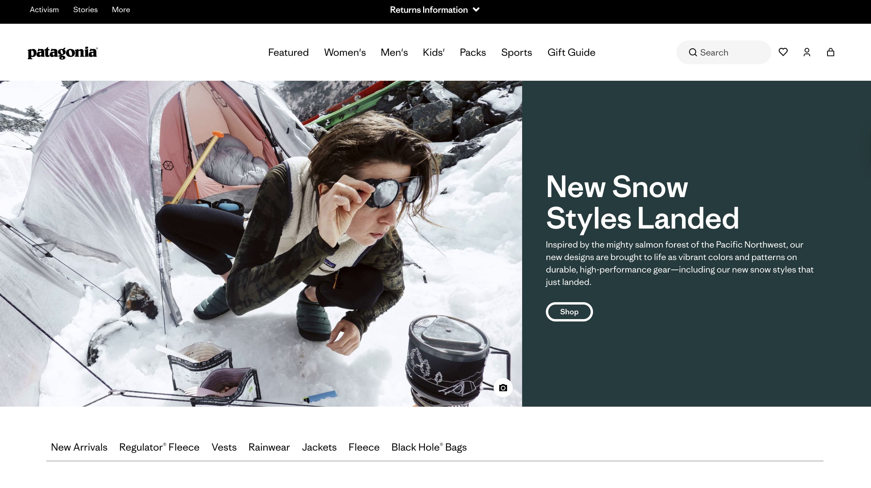
Patagonia’s Visual Storytelling
Patagonia doesn’t just sell outdoor gear — it sells a lifestyle rooted in authenticity and purpose. Their ecommerce design mirrors that philosophy. Every page tells a story through images: customers in real environments, vertical scrolling narratives, and side-by-side use cases that blend human connection with product detail. The pacing feels cinematic — quiet studio shots transition into full-bleed mountain scenes, then return to intimate close-ups of materials and textures.
This rhythm keeps shoppers emotionally engaged from start to finish. Patagonia treats photography as a form of storytelling, not decoration. Each campaign season comes with its own color palette, lighting tone, and emotional cue. Pixofix supports this creative process by handling large-scale retouching and tone matching across campaigns, helping the brand maintain its rugged yet aspirational aesthetic. The outcome is an experience that inspires action — not just to buy, but to believe in the story the brand tells.


.png)
.png)