.png)

How To Write A Visual Style Guide For Ecommerce: What Creative Teams Need To Document Before Outsourcing Image Production
Most retouching briefs fail before they are written. The root cause is almost never a bad brief. It is the absence of a visual style guide that makes a good brief possible in the first place.
A retouching brief answers the question: what do we need from this batch? A visual style guide answers the prior question: what does our brand actually look like in production terms? Without that foundation, every brief becomes a negotiation, every vendor batch becomes a guessing game, and rework compounds until the cost of outsourcing approaches the cost of doing it internally.
This guide explains what belongs in a visual style guide for ecommerce, what format works for external teams, how Pixofix uses client style guides during intake, and how to version-control the document so it does not drift out of sync with production reality.
Why the brief is not the starting point
When retouching quality fails at scale, creative directors usually blame the brief. The vendor did not follow instructions. The tone was off. The skin looked wrong. But if you trace those failures back, the same problem appears: the brief assumed shared knowledge that did not exist.
A brief is operational. It says: for this batch, remove the mannequin, use background hex 255 255 255, deliver by Thursday. It cannot also be the place where you define what "natural skin" means to your brand, what shadow density you accept on white backgrounds, or how tight your crop should sit on a denim jacket versus a wool coat. That context has to live somewhere before the brief is written. That somewhere is your visual style guide.
"Clean and premium" means nothing to a retoucher working across time zones or a generative pipeline processing 2,000 SKUs overnight. "No highlight above 230, no shadow below 15, retain pore texture on all skin tones, no frequency separation on full body shots" is operational. That level of specificity is what keeps output consistent across operators, vendors, and AI tools when volume scales past the point where an art director can supervise every image.
A useful test: if a new retoucher and a generative model can both follow your guide and land within tolerance on a 50 SKU pilot batch, you are ready to outsource at scale. If you still rely on "you will know it when you see it" approvals, you are not.
What goes in a visual style guide for ecommerce
A guide that works at catalog scale reads like a technical document, not a brand manifesto. Start from output requirements and work backward to production decisions.
Color references and white balance targets
Specify color in values, not adjectives. For each backdrop color and product category, document:
- White balance target in Kelvin, or specific RGB values for each major neutral
- Acceptable Delta E range for critical colorways, particularly whites, blacks, and brand signature colors
- Whether color matching is done to physical swatch, digital swatch, or a calibrated reference file
- Saturation treatment by category, for example muted for outerwear, slightly lifted for accessories
If you use Capture One, include base style names and curve recipes per category. These become the standard input state for retouchers and the calibration baseline for any AI preprocessing step. Attach the actual Capture One style files as appendices so vendors can apply them directly, rather than interpreting written descriptions.
Lighting rationale and parameters
Do not just document what your lighting looks like. Document why it looks that way, so vendors understand the intent behind the rules and can make judgment calls on edge cases without asking.
For each shoot configuration, include:
- Key light angle in degrees relative to camera axis, plus height relative to subject
- Modifier type and power ratio for key, fill, and kicker
- Whether fill is positive or negative, and how much shadow density to retain
- Floor reflection policy for each backdrop type
- How shadow direction and length should read on the final PDP grid
The rationale matters particularly when integrating AI tools. If vendors understand that your fill ratio is deliberately low to create garment dimension on knitwear, they will not accept AI outputs that auto-lift shadows and flatten texture in the name of "enhancement."
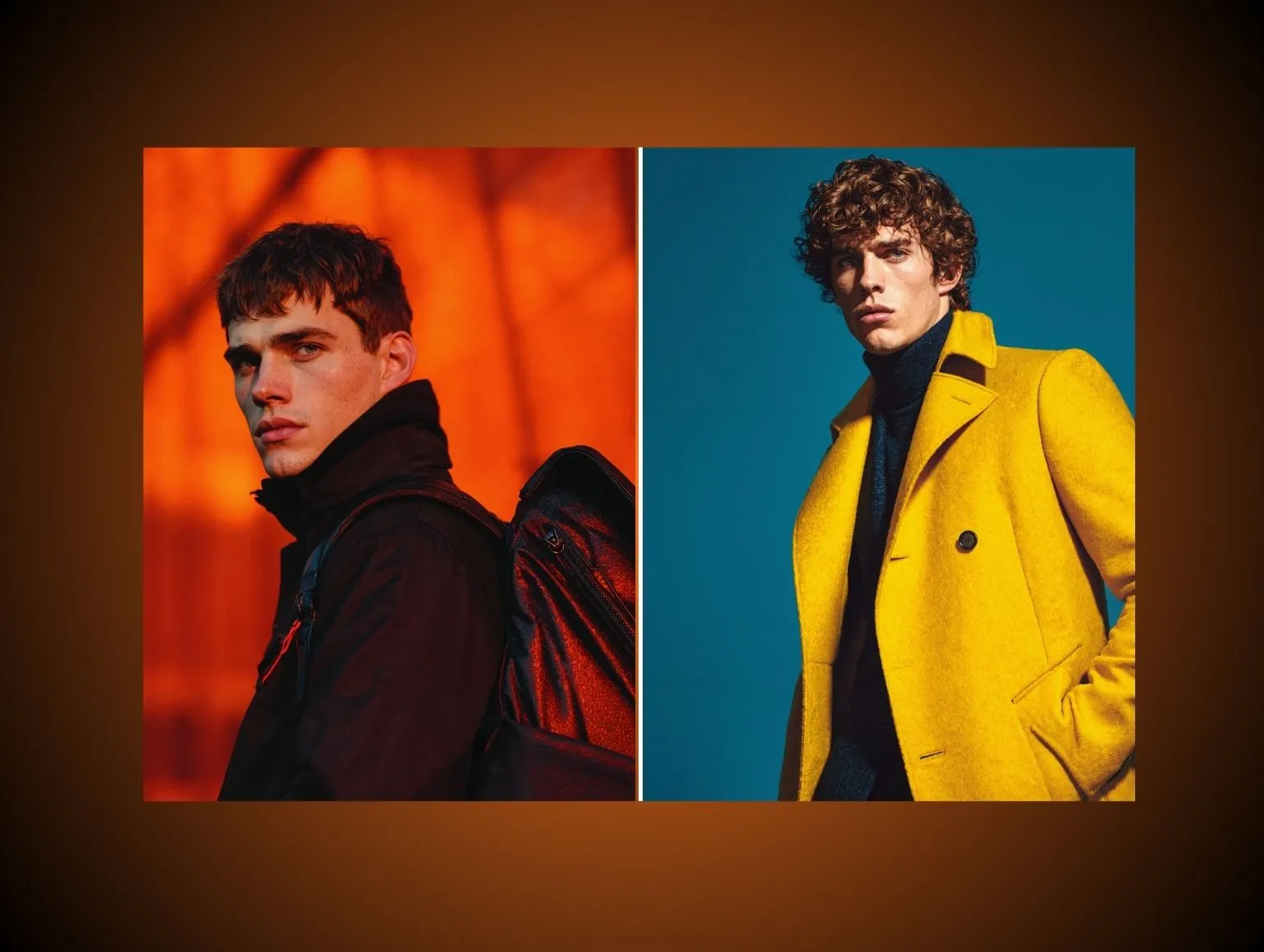
Skin tone treatment by lighting scenario
Skin tone is where vendor interpretation causes the most visible and most damaging inconsistency. The same instruction applied differently across operators produces category pages that look stitched from three different shoots.
Document separately for each primary skin tone range:
- Whether to apply frequency separation and at what strength
- Dodge and burn limits: is it permitted at all, and to what degree
- How much grain or texture to retain on different skin types
- What constitutes a blemish versus a permanent feature
- How to handle transitions between skin and fabric, particularly on knit and lace
Include annotated image examples for each scenario: dark skin under high contrast lighting, fair skin with hard shadows, warm tones under cool-balanced strobes. Text rules without visual references leave too much room for interpretation.
Shadow policy
Shadow decisions drive the feel of an entire category grid. They also interact with AI tools in unpredictable ways when not explicitly constrained.
Specify:
- Shadow type allowed: none, drop shadow, natural shadow, or cast shadow
- If drop shadow: angle, distance, spread, opacity, and whether it should feather or cut clean
- If natural shadow: maximum density in values, not descriptors
- Floor reflection: allowed, discouraged, or required for specific categories
- How shadows should behave on transparent or sheer products
State explicitly that AI tools may not alter shadow placement, add ambient occlusion fills, or generate new shadows not present in the original capture. Include before and after examples of acceptable and unacceptable AI shadow behavior.
Crop specifications by marketplace and channel
Crop is not a creative decision at catalog scale. It is a production spec, and it needs to be documented like one.
For each channel and marketplace, specify:
- Aspect ratio and pixel dimensions
- Minimum safe zone for key product elements
- How much headroom and foot room is acceptable for on-model shots
- Whether generative fill or AI extension is permitted for aspect ratio changes, and how outputs must be reviewed
- Marketplace-specific constraints, such as Amazon's pure white background requirements or Zalando's crop standards for footwear
Create overlay templates usable inside Capture One, Photoshop, or AI post tools so operators see live crop guides during production rather than estimating from written specs. Attach these as downloadable files in the guide appendix.
Visual style guide versus retouching brief: why both matter
These two documents are frequently confused, and occasionally collapsed into one. That collapse is where outsourcing consistency starts to break down.
The simplest way to think about it: the style guide is written once and maintained across seasons. The brief is written for every batch. The brief points to the guide; it does not contain it.
In practice, the distinction matters most when something goes wrong. If a vendor delivers batch 12 with inconsistent skin treatment and your only documentation is a series of briefs, you have no stable reference to point to. You cannot say "this violates section 3.2 of the standard we agreed on in January" because that standard was never formally documented. You can only say "this looks wrong," which opens a negotiation rather than closing a quality issue.
A style guide gives you that stable reference. It is the document that makes accountability possible, because it exists independently of any single batch or vendor relationship. When a new studio, retouch house, or AI partner joins your supply chain, they receive the guide first. The briefs they receive afterward assume that foundation is in place.
The content of each document reflects this division. Your style guide covers the decisions that should never change from batch to batch: what your lighting rationale is, how skin texture should be treated across tone ranges, what shadow density is acceptable on white backgrounds, how crops sit relative to garment midpoints on each channel. Your brief covers the decisions that are specific to this batch: which SKUs, which background, which delivery date, which version of the style guide is active.
One way to check whether your documentation is structured correctly: open your last three retouching briefs and look for any sentence that would apply equally to all three. If you find brand-level standards repeated across briefs, those standards belong in a style guide, not a brief. Repetition in briefs is a signal that the permanent document does not exist yet, or does not cover enough ground to be trusted.
What format works for external retouching teams
A style guide is only as good as its usability for the people who have to follow it. A 60-page PDF that lives in a shared drive folder no one has bookmarked is effectively no guide at all.
Recommended formats by use case
For primary vendor distribution, a structured PDF with a visual index works best. It can be opened on any device, does not require tool access, and can be annotated with reference images throughout. Version the file name explicitly, for example Pixofix-StyleGuide-v2.1-SS25.pdf, so there is never ambiguity about which document a vendor is referencing.
For internal creative and retouching teams who work inside production tools daily, a Notion or Confluence page with embedded reference images and direct links to downloadable asset packages is more practical. It can be updated without re-distributing a file, and links can be included directly in batch briefs.
For QC leads and senior retouchers, a one-page laminated quick-start card covering the five most common decisions (crop, shadow, skin, color, background) reduces lookup time on tight SLAs. This is not a replacement for the full guide; it is a live-production reference that assumes the reader has already absorbed the document.
What the document structure should look like
Do not bury the operational rules inside brand rationale. Structure it so a new operator can find the answer to a production question within 60 seconds.
A structure that works at scale:
- Quick reference card: the five rules that apply to 80 percent of SKUs
- Channel outputs: crops, formats, and file specs by channel
- Brand look parameters: lighting, color, shadow, and composition
- Category-specific rules: variants by product type
- Retouching limits: what is permitted, what is not, with examples
- AI usage policy: which tools are approved, where, and how outputs are reviewed
- Vendor handoff specs: file structure, naming, masks, and delivery format
- Appendices: Capture One styles, overlay templates, reference image decks, change log
Keep the main body to what a retoucher needs during production. Move rationale and history to appendices.
How Pixofix uses your style guide during intake
When a new brand onboards with Pixofix, the intake process is built around one goal: eliminating ambiguity before a single production SKU is touched. That process reveals exactly where style guides succeed and where they create problems at scale.
The pilot batch as a guide audit
Every new account begins with a controlled pilot batch of 30 to 50 SKUs, selected to cover the most challenging scenarios: difficult fabrics, multiple skin tones, critical colorways, and at least two different crop configurations.
The pilot is not just production validation. It is a live audit of the style guide. Pixofix QC leads compare every output against the client's reference deck and flag every point where the guide was insufficient, contradictory, or absent. These flags go back to the client as a structured annotation document, not as open-ended feedback, but as specific questions tied to specific decisions: "Your shadow policy says 'minimal' but provides no density value. We applied X on this SKU. Confirm or correct."
If vendors or internal teams ask for clarification on more than 10 to 15 percent of guide instructions during a pilot, the guide is not specific enough. That threshold is a diagnostic, not a judgment.
What Pixofix validates before full capacity
After the pilot, Pixofix does not move to full catalog volume until three things are confirmed:
First, the first-pass acceptance rate on the pilot batch meets the agreed threshold, typically 90 percent or above for stable categories. If it does not, the team identifies whether the shortfall is in guide specificity, operator training, or an edge case requiring a new guide section.
Second, the client has reviewed and approved annotated examples from the pilot, which then become the binding reference deck for the account. These are not moodboard references. They are calibrated outputs with values attached.
Third, any guide gaps flagged during the pilot have been resolved in writing, either as an update to the style guide document or as a batch-specific addendum formally signed off by the client's creative lead.
This sequence protects both sides. It means that when Pixofix processes 500 to 10,000 SKUs per month for an account, the rules governing those images are explicit, agreed, and traceable to a specific document version.
How ambiguity is handled in production
Even well-written guides have edge cases. When a retoucher encounters a scenario not covered by the guide, the protocol at Pixofix is: flag, do not interpret.
A flagged SKU goes to a QC lead with a written note explaining the gap. The QC lead either applies the nearest analogous rule and documents the decision for client confirmation, or holds the SKU and sends a clarification request through the established channel. The client has a defined response window, typically four hours for in-progress batches, before the hold affects SLA adherence.
Decisions made during production are logged and fed back into the style guide at the next version update. The goal is that each season, the number of holds and flags decreases as the guide becomes more complete.
How to version-control a visual style guide
A style guide that is not versioned becomes unreliable within two seasons. Vendors run current production against outdated rules. Internal teams apply informal changes that never make it into the document. AI pipelines run on parameters that have drifted from the creative brief.
Naming convention
Use a three-part version number: major version, minor version, and season code.
For example: v3.2-AW25
A major version (v3 to v4) reflects a significant creative shift: new lighting setup, rebrand, new product category added. A minor version (v3.1 to v3.2) reflects a targeted update: one section clarified, new examples added, one rule tightened. The season code ties the document to a production context without creating ambiguity when vendors work across seasons simultaneously.
Every batch brief should reference the style guide version explicitly. Vendors confirm in writing which version they are working from before a batch begins.
What triggers a version update
Schedule reviews are not enough. Version updates should be triggered by specific events:
- Any change to studio lighting setup or primary modifier configuration
- Adoption of a new AI tool or significant update to an existing one that changes color or structure output
- Addition of a new product category or significant new marketplace channel
- More than three flagged edge cases in a single batch that required on-the-fly decisions
- Seasonal creative shift that changes any parameter by a meaningful amount, even if the change seems minor
Do not accumulate changes and release them quarterly. Each trigger event should produce a minor version update within five business days, with a change log entry that clearly states what changed and why.
The change log structure
Maintain a change log as a simple table at the front of the guide document, not in a separate file. Keeping it visible ensures vendors check it when they receive a new version.
Each entry should include: version number, date, section affected, nature of the change, and who approved it.
For example: v3.2, March 14 2025, Shadow Policy section, added specific density values for drop shadow on jewelry category, approved by Creative Director.
When you issue a new version, require vendors to acknowledge receipt and confirm the version number they will use on the next batch. This creates a simple audit trail that becomes useful if output quality drops and you need to trace whether a vendor was running an outdated version.
Seasonal appendices versus core guide updates
Your core production parameters should be stable across multiple seasons. Resist the urge to rewrite the guide each season. Instead, create seasonal appendices that reference and modify the core document.
For example: "AW25 appendix: key contrast lifted by half a stop relative to v3.2 base. White balance cooled to 5000K for outerwear category only. All other specs per v3.2."
This approach keeps the core guide as the stable reference and prevents vendors from having to relearn the full document each season. Operators can carry the core rules and check only the appendix for what has changed.
Common mistakes to avoid
Leaving style decisions in subjective language
Assuming vendors or AI pipelines will interpret "natural," "premium," or "editorial" correctly is the most common failure mode. Each operator applies personal taste to fill the gap. Across 10 operators and 5,000 SKUs, that produces visible inconsistency.
Fix: translate every subjective descriptor into a measurable parameter before the guide is distributed. "Natural skin" becomes a specific statement about texture retention, frequency separation limits, and dodge and burn policy. Attach calibrated reference images to every rule.
Writing a guide that is too long to use under time pressure
A 90-page style guide is not thorough. It is unusable. Retouchers working under a 24-hour SLA cannot cross-reference 90 pages per SKU. They will default to memory and personal judgment, which defeats the purpose of having a guide.
Fix: put the must-know rules in a short front section of no more than eight to ten pages covering the decisions that affect 80 percent of SKUs. Move category exceptions, extended rationale, and reference material to appendices. Create a one-page quick-start card for operators.
Failing to update after production changes
A guide that does not reflect current production practice becomes harmful. Vendors who follow it produce output that looks wrong. Vendors who ignore it and copy what they think current style is produce inconsistency that is harder to diagnose.
Fix: assign one owner responsible for the guide's accuracy. Tie version updates to the trigger events listed above. Review the guide against current production output twice a year at minimum, with studio, retouching, and creative leads in the same room.


.png)
.png)