.png)


Watch Product Photography & Retouching Guide
Watch Product Photography & Retouching: Reflections, Metal Finish & Dial Detail
A watch is a small object asking to be judged at full detail. The dial, the crown, the clasp, the engraving inside the caseback: all of it sits inside a frame the size of a coin, and a customer zooming in on a product page will find every flaw that fits inside that space. A T-shirt can absorb a slightly soft focus point. A watch cannot.
Part of the difficulty comes from what a watch is actually made of. A single piece typically combines glass, polished metal, brushed metal, and a strap in leather, rubber, or mesh, and each of those materials reflects, absorbs, and holds color differently under the same studio lights. Retouching a watch means correcting several materials in the same frame at once, not applying one treatment across the whole product.
That combination shows up in four places where watch images most often fall apart: reflections across the crystal and case, dial legibility once the image shrinks to thumbnail size, accurate metal-finish rendering across a collection, and strap material that reads as flat or plastic instead of leather, mesh, or rubber. Each one needs a different fix, and getting any of them wrong is the kind of flaw a watch shopper will actually notice.
Reflections and Glare Off Crystal and Metal Casing
A watch crystal is curved glass, not flat, so the reflections it throws back move as the viewing angle shifts. That curve is why reflections often show up as bands of light crossing the dial rather than one fixed highlight, and it's also why a straight-edge clone job that works fine on a flat surface leaves a visible seam here. The correction has to follow the same curve the reflection did.
Some of this gets solved before the camera fires. Side lighting or angling the light source away from a direct hit on the glass reduces the harshest glare at the source, and a photographer who knows this in advance saves the retoucher hours of cloning work later. But some reflection on a crystal is unavoidable, and that's fine. The goal in retouching isn't to erase it.
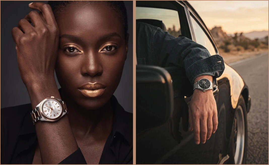
Over-correcting a crystal until every reflection disappears makes the watch look rendered rather than photographed. A believable watch image keeps a trace of the case and crystal's actual shine. What gets removed is the reflection sitting directly over an index or a hand, breaking legibility, not the reflection that tells the viewer this is polished sapphire glass rather than a flat sticker.
Keeping the Dial Legible at Thumbnail Size
The dial is what a customer is actually buying. Everything else on a watch supports it, but the hands, indices, and any text on the dial are what someone scans first, often at a fraction of the size the photo was shot at. A product grid thumbnail or a marketplace search result can shrink a six-thousand-pixel image down to a few hundred, and any softness in the dial that was tolerable at full resolution becomes illegible at that scale. This is where a lot of otherwise strong photography loses conversions without anyone noticing why, the flaw doesn't show up until the image is small, which is exactly the size most shoppers see first.
Selective sharpening on the dial, hands, and indices needs to be strong enough to survive that shrink. Details like the date window and any applied indices matter too. These sit physically raised off the dial surface and cast small shadows that tell the eye the piece has real depth, and removing that shadow in the name of a clean edit flattens the dial instead of improving it.
One detail specific to watches: lume, the luminescent coating on hands and indices, often picks up an incorrect greenish cast under studio lighting. Correcting it needs a masked hue adjustment on just the lume areas, not a global color shift that would drag the rest of the dial off target.
Rendering True Metal Finish Across a Collection
Gold has to read gold, not yellow. Rose gold has to read warm without tipping into orange. Steel needs to look cool and reflective, not gray and flat. Each of these is a different color decision, and a retoucher working from screen judgment alone, rather than the physical piece, will drift. That drift is invisible on a single image and obvious the moment two watches from the same collection sit side by side on a product page and one reads warmer than it should.
The fix is a physical reference, not a better eye. Shooting a color checker card alongside the piece under the same lighting gives the retoucher something to calibrate against instead of guessing from a monitor. For a full run of SKUs shot under the same conditions, batch color-sync tools handle the matching, which keeps the whole collection consistent instead of correcting each image in isolation.
This is one of the images from our own production work: a rose-gold case against a blue leather strap, shot on location. The case reads warm without going orange, which is the exact balance the color-reference process above is built to protect.
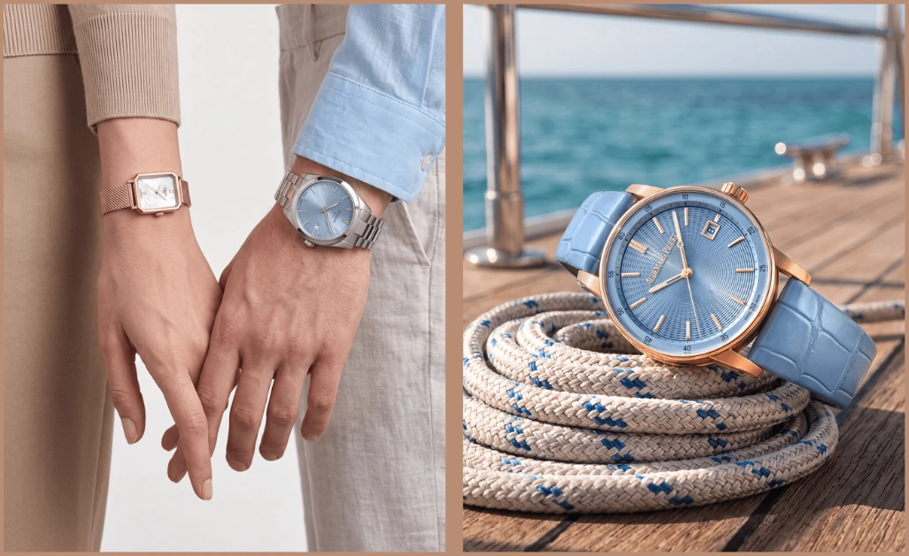
Getting this right at scale, not just on one hero shot, is closer to what a color correction service is actually solving for than most brands assume going in.
Strap and Band Material Handling
A strap failure is different from a case failure. Leather, rubber, and mesh don't reflect light, they absorb and scatter it, and each does it differently. Leather has grain. Rubber has a slight sheen without hard reflections. Mesh has hundreds of tiny links that each catch light on their own. Treat all three with the same retouching approach and at least one of them will come out looking like plastic.
The temptation is to reach for frequency separation, the layer technique built for smoothing skin without losing texture, since it seems like an obvious fit for smoothing a strap. It isn't always. On heavily textured surfaces like leather, frequency separation can behave unpredictably if the blur radius is off, and product work with even, continuous surfaces often responds better to straightforward dodge and burn instead. The right tool depends on what the strap is actually made of, not on which technique sounds more advanced.
The blue leather strap in the image above is a useful case in point. The croc-embossed grain has to stay visible after retouching, since a leather strap smoothed flat under the light reads as fake right next to a case that still shows real polish. Mesh presents the opposite problem: dozens of tiny reflective links across a small area, where the goal is keeping definition between individual links instead of letting them blur into a single gray band. Rubber sits somewhere in between, enough sheen to look like the actual material, not so much that it reads as wet or glossy.
Where This Fits With Jewellery-Adjacent Retouching, and What to Check Before You Brief a Team
Everything covered here, reflection control on curved surfaces, color accuracy tied to a physical reference, texture preservation by material type, sits closer to jewellery retouching than to general apparel or footwear work. The two categories share the same core problem: small, reflective, high-scrutiny products where a flaw that would go unnoticed on a jacket becomes the reason a customer opens a return request. If your catalog spans both watches and jewellery, the retouching standards that apply to one mostly carry over to the other, worth knowing before briefing two separate teams for what's functionally one skill set.
What doesn't carry over cleanly is volume and turnaround expectations. Watch photography is slow to shoot and slow to retouch properly, focus stacking alone adds real time before color and texture work even starts, so a team used to fast apparel turnaround can underestimate what a full watch collection actually requires. Before handing off a batch, it's worth confirming three things: whether the retoucher has handled curved-crystal reflections before, whether they have a process for matching metal tone across a full SKU range rather than image by image, and whether they treat different strap materials differently or apply one default texture pass to everything.
This is closer to high-end retouching territory than high-volume catalog work, even when the SKU count is large, because the per-image judgment calls don't compress well. A brief that treats a forty-piece watch collection like a four-hundred-piece t-shirt drop will produce inconsistent results regardless of how skilled the individual retoucher is.
Closing Judgment
Watch photography rewards patience more than most fashion categories, because the flaws that matter are small enough to hide in a quick edit and big enough to matter the moment someone zooms in. The four pillars here, reflection control, dial legibility, metal accuracy, and material-specific texture handling, aren't separate skills so much as one discipline applied to four surfaces on the same object. Get the retoucher's process right for one, and the other three tend to follow.




.png)
.png)
